Take a tour of the National Gallery’s collection with artist Clive Head: discover how painters throughout history have constructed architecture and space.

Clive Head: An Artist's Perspective
Transcript
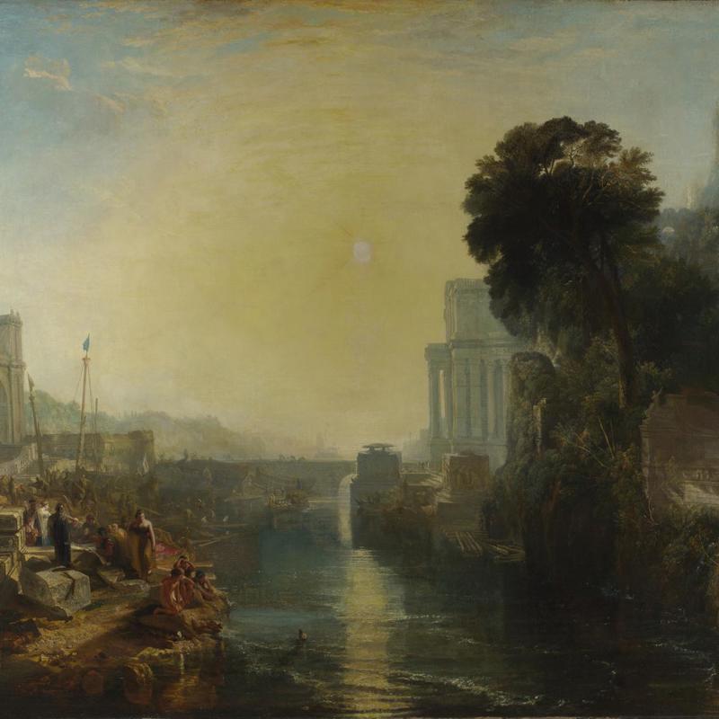
Clive Head: At first glance, it would seem that [Joseph Mallord William] Turner is using a very conventional composition for this painting – with this large mass of trees occupying the golden section on the right-hand side of the painting, balanced by simple constructions on the left and to the right. I think we can find that kind of composition throughout the history of landscape painting.
However, if we look again, we can see him playing some extraordinary spatial games. In fact, rather than seeing this as a single entity of one perspective, we see him playing with perspective. So he creates a kind of space, which we can explore as if we were a bird flying through, and above, and around the painting.
If we look at the little temple on the hill right at the top of the painting... and if we drew the lines of perspective from the side of that temple, we would see that they do not meet anywhere near the horizon line. Those lines would meet somewhere way above the sky. So he’s playing with perspective. He’s saying to look up here I can introduce a higher horizon line – a new little perspective for that part of the painting.
If we then move lower down into the painting and look in the central areas, we see these rather strange constructions: temples, buildings in the centre part of the painting and the top of those buildings pretty much line up with the horizon line. And yet we can actually look down on those buildings. He knows that the point at which space collapses is the point at which any line conforms with the horizon line – because at that point we can either see down on it or up. And that’s the point of flatness in the painting. So Turner takes liberties with that and makes sure that at each point we either see up or down – we are peering around corners, we are moving up and down throughout the painting. So there are many, many different uses of perspective to create little pockets of space throughout what first appears to be quite a conventional landscape.
But in addition to that, Turner’s mastery of space really comes through the application of the paint. At no point do we really get a fix of where the paint exists on the surface of the canvas, because we’ve got so many layers of paint. The depth of space that we have just in the painting of the foliage is created by these deep pools of colour; the shine of the paint itself denies that fixing in space in any conventional sense.
Clive Head examines Turner's use of perspective. Is the scene created here really as conventional as first appearances might suggest?
Hear more from Clive Head's tour

